| The Scale Colour Myth |
There is no such thing as scale colour. There, I've said it.
|
For those of you not familiar with the concept, it is, in a nutshell,
that the further away you get from an object the more our perception of
its colour changes due to atmospheric interference; ie, darker colours become
lighter and lighter colours become darker, very generally speaking. In the
context of modelling, scale colour is an attempt to capture this full size
phenomenon in miniature so precisely that your brain is fooled into thinking
it’s looking at the real thing parked x number of feet away instead
of a model sitting inches from your nose. It is the unattainable enlightenment
of Zen modelling.
|
Take for example a 1/72 scale aircraft model, where 1 inch equals 6 feet
on the real object. In other words, a model with an 8 inch wingspan scaled
up 72 times would equate to a full size aircraft with a 48 foot wingspan.
By this logic, viewing a model from an average distance of 12 inches would
equate to looking at the real thing from a distance of 72 feet. Similarly,
a 1/48 scale model viewed from the same distance would be like looking at
the real thing from a distance of 48 feet. According to the scale colour
rulebook, paint hues change proportionate to the distance from the viewer,
therefore a 1/72 scale model would need to have its paint altered by a greater
percentage than a 1/48 scale model because it represents an object viewed
from a greater distance.
|
I'm not sure if Ian Huntley is the instigator but he certainly went into
great depth on it in his series of articles in Scale Aircraft Modelling,
even to the point of coming up with charts giving percentages that paint
must be altered for each of the popular modelling scales. Harry Woodman,
a modeller whose skill I greatly admired, was also a proponent of the theory.
Both cited the use of the technique by artists as an effective way of representing
distance and perspective in paintings. Though this was the basis of their
arguments for scale colour, to me it is actually the fundamental flaw in the theory.
|
Artists use the technique because they are attempting to create the illusion
of a three-dimensional world within the constraints of a two-dimensional
medium. Assuming the artist set out to create realism (as opposed to Cubism,
Surrealism or some other kind of ‘ism), a landscape portrait would
lose any semblance of depth and distance and look amateurish if the mountains
in the background were painted with the same intensity as the bowl of fruit
in the foreground. Our perception of colour does change over distance, this
I am not disputing, and the principal works very well in a two-dimensional
painting. But we modellers are not working with two-dimensional subjects,
therefore painting them to try and capture a sense of depth and perspective
is not only unnecessary, it is unrealistic and inaccurate. It works in the
painting because the theoretical distance between the bowl of fruit and
the mountain is fixed and the whole image works as a single scene with all
the elements viewed in context. It doesn’t work with models because
they can be viewed from any distance and they are clearly models sitting
on a shelf, no matter how they’re painted.
|
The concept could be put to use in a large scene where the lighting and
viewing angle are strictly controlled, such as an airfield diorama which
could only be viewed from one end. In this case it would probably be quite
effective to paint the aircraft and surrounding scenery in progressively
altered shades as the distance between them and the viewer increased. Like
the painting, the distances and viewer’s perspective are fixed and
the elements work together to produce a single coherent scene. But take
those elements out of that scene and place them side by side and you suddenly
have aircraft that, though they should be the same, look completely different
from each other because they are being viewed out of context. The faded
Hurricane from the far end of the diorama doesn’t look like the pictures
you have of Hurricanes because the colours are all wrong and it looks out
of place next to the other Hurricanes on the shelf.
|
Scale colour seems to be the sole domain of military modellers and I believe
this is the main reason why it has been so widely accepted without question.
Military models don’t look wrong to our eyes with faded and dulled
paint, not because of any “scale effect”, but because military
subjects fade and get dull! Personally, I know of no modellers of civilian
aircraft or vehicles who apply scale colour rules to their models, in fact
a couple I mentioned it to gave me a blank stare – they had never
heard of such a thing. This is not surprising when put into perspective
(no pun intended). A Spitfire with faded and weathered paint looks just
fine but a John Players Special Lotus would look decidedly odd painted in
dark grey with pale gold pinstripes, just as a Quantas Airbus A380 would
in off-white with a pink tail. But how can this be so? Scale models are
miniature representations of the real thing regardless of the subject matter,
therefore the same rules should apply whether you’re building shiny
racing cars or drab earth movers. The answer is of course that it’s
all in the perception of the beholder and our expectations when viewing
a certain subject. We expect bright shiny colours on cars and civilian aircraft
just as we expect military subjects to be faded and grimy. We don’t
question the use of scale colour in the latter genre because it satisfies
our expections of a well used, war weary subject, nor do we frown upon bright
colours in the civilian world because again, it’s expected. It’s
“right”. But the faded colours on military subjects are not
“scale” colours, they are weathered colours. The modeller may
have painted it with scale colour in mind, but it’s fooling no one
into thinking it’s actually the real thing parked however many feet
away. It looks right because we have a preconceived idea of what a well
used military vehicle or aircraft should look like and scale colour rules
merely cater to that notion, albeit for all the wrong reasons.
|
The basic concept is therefore flawed in my opinion, but if we insist
on adhering to the bizarre idea of scaling down a colour(!) then we must consider
just how many variables we are actually trying to capture in order to paint
a model so it more closely represents the real thing viewed from a certain
set distance. With respect to the late Mr. Huntley, the idea of actually
drawing up a chart - even as a rough guide - is ludicrous. Consider these
points:
|
- The original paint could change dramatically for a good many reasons.
Though we may rely heavily on structured paint references such as the
Federal Standard or Methuen systems, it is not nearly so cut and dried
in the real world. Different paint manufacturers had different interpretations
of the official colour specs - if there were any - and different paints
weathered in different ways. And during wartime official standards sometimes
went out the window due to lack of supply of the correct paint. Ground
crews often painted aircraft with whatever paint they had to hand and
it may or may not have been the "correct" colour. Anybody
who has owned a white car knows just how many variations of white there
are when it came time to buy a spray can of touch up paint.
How can it be said then that olive drab paint must be lightened by 10%
for a 1/72 scale model when the paint on full size aircraft may change
that much or more from aircraft to aircraft? Which shade do you lighten
and by how much: the factory fresh olive drab on a P-40B built by Curtiss
in 1940, or the weathered olive drab on a P-51B built by North American
in 1943?
- Taking samples from original paint on museum examples is also unreliable.
Paint oxidises, fades, and gets dirty over the years. Austro-Hungarian
WW1 aircraft are a good example. For years it was thought that some
were painted in the so-called "Autumn Leaf" camouflage - red/brown and
green hexagonals painted over a mustard yellow base. Recent chemical
analysis has shown that the paints used were actually three different
shades of grey, and that the paint and overcoat of varnish had oxidised
over the years and turned into the "Autumn Leaf" colours. I recommend
reading Robert Mikesh's book "Restoring Museum Aircraft" (Airlife, 1997)
for a good insight into the difficulties of matching paint from surviving
specimens.
- I think it's safe to say that most of us work from photographs of
the real object we're modelling, even with modern subjects. It's just
not practical or possible to visit airfields, military bases or war
zones all the time to match up paint colours, and that just isn't an
option for most historic subjects unless you have access to a time machine.
If anyone out there does by the way please let me know - I'd love to
borrow it someday just to see if anybody really was on that grassy knoll
in 1963. But I digress....
Photographs bring a whole new set of variables into the equation. Different
film, different cameras, different lighting, different labs developing
the film. Even two photos of one subject taken from different angles
will show the same paint differently due to refraction. The digital
revolution hasn’t removed these variations, in fact it has added
its own set of idiosyncracies. It all adds up to incredible variations
in colour when working from photographs.
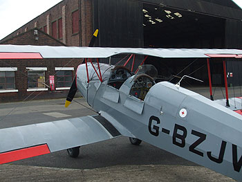
Above: Both photos were
taken at the same time with the same digital camera on the same settings.
Both are of the same side of the aircraft but from different angles
and distances. Which grey do I lighten and by how much to make my model
look more like the real thing? And which angle and distance am I representing?
Presumably I would then only ever be able to look at my model from the
same angle and (scale) distance in order for it to be a completely faithful
reproduction. Note too that these photos are contrary to the scale colour
rulebook; the aircraft appears much lighter in the closer picture. Should
I not therefore be darkening the paint to represent an object
further away, rather than lightening it as scale colour says I should?
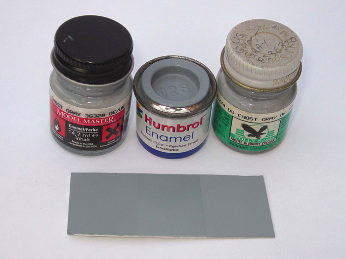
- The hobby paints we are using vary immensely, despite the fact that
many of them claim to be authentic matches. When painting the cockpit
of my Hasegawa Tomcat, I compared paints from Testors, Humbrol and Polly
Scale. All purported to be matched to FS 36320 yet they were all quite
different from each other, and none of them matched any of the colour
photos I had of Tomcat cockpits! In other words, why change the colour
of paint by a certain pre-ordained amount simply because it's an "out
of the bottle" colour? It could very well be the wrong shade to
begin with and lightening it will only exacerbate the error.
As an interesting aside, I have several of the same shades of paint
from both Aeromaster and Polly Scale. Both brands were manufactured
by Floquil and were, for all intents and purposes, the same paints in
different bottles. Aeromaster boasted that its paints were lightened
for "scale effect" while Polly Scale made no such claims -
yet they are exactly the same shades. It’s obvious that had I
altered the Polly Scale paints for scale effect I would have ended up
with different shades to Aeromaster which already claimed to be scale
colours! Aeromaster, I might add, annoyed me to no end with its insistance
on the use of scale colour for its decal sheets. Their Japanese markings
in particular were far too orange and really bore little resemblance
to bright red hinomarus. Also the red in some of their British roundels
looked closer to pink than a brick red. Neither of them looked "right"
to my eye.
And while I’m at it, scale black is just silly. There is dark
grey and there is black, there is no “scale black” (and
before you point it out, yes I know that there is no such thing as “pure”
black in the paint world anyway). I’m reminded of a certain Father
Ted episode where the differences between priest black socks and non-priest
black socks are discussed….
- Lighting and weather conditions can affect colour perception immensely.
An aircraft viewed in a poorly lit hangar on a dull day will look completely
different out in bright sunshine. Similarly, a model lit by a 60 watt
desk lamp will appear to be a very different colour when viewed by fluorescent
light, or by natural light. How then would scale colour be at all relevant
or useful to an object that looks different in varying light qualities
anyway? In order to achieve the Zen of scale colour, surely I’m
limited to displaying my model in the same quality of light the original
was viewed in?
- If we take it to the nth degree, wouldn't 1/700 scale ships end up
being a single monotone shade? Just spray the whole thing; propellers,
hull, decks, superstructure, aircraft - everything - a very pale grey
or off-white and be done with it. It would certainly simplify the painting
process, wouldn't it?
- Finally, and to me the paramount reason, I don't for a second look
at my models (or anyone elses’s models for that matter) and think
of them as the real thing 72 feet away. Call it cynicism, call it a
lack of imagination, but I just can't suspend my disbelief that much
- nor do I particularly want to. They are supposed to be miniature representations
of the full size object and therefore should be painted in as close
to the same colours as the full size object as I can get. If an RCAF
Harvard is trainer yellow with a black anti-glare panel then that’s
how my model should be painted, not pale yellow with a dark grey anti-glare
panel. While I try to be as accurate as I can when building and painting
models, my idea of accurate does not extend to dubious colour changes
based on hypothetical atmospheric conditions and viewing distances.
Models I've seen completed according to scale colour rules looked to
be nicely faded and weathered, but they didn't look any more like the
real thing parked x number of feet away than the rubber toy in the original
King Kong did a giant ape. They looked like models with faded paint.
|
Yes, our perception of colour does change the further away objects are,
I'm not debating that. What I am saying is that attempting to reproduce
this effect in model form is folly. Distance is but one variable in a very
long list of variables and trying to compensate for all of them simply by
splashing some white paint in your camouflage colours is not only pointless,
it is no more accurate or realistic than a model painted with a straight-out-of-the-bottle
colour. Why bother researching colours and worrying about the correct FS
paint if you’re just going to change the final shade anyway? You may
just as well paint it with any old paint that comes to hand. Furthermore,
the practice has been taken completely out of context, adopted from a different
medium with a different objective that is in no way relevant to scale modelling.
Recreating a distant mountain on a flat piece of canvas is about as similar
to a model of a Sherman tank sitting in a display cabinet as a Volkswagen
Beetle is to a pot of marmalade. The latter two are exempt from scale colour
rules anyway of course, unless they’re military issue!
|
"Scale colour" is, in my opinion, a modelling fad that has been
adopted because it is considered to be en vogue to do so and I think many
people adhere to it without actually thinking it through. It has been instilled
in us to such an extent that we automatically see a model as “wrong”
if it has been painted with colours straight out of the bottle (though really,
with all the variations in model paint, how would we know that if the modeller
doesn’t tell us?!), but the scale colour standards are nothing more
than guesswork based on a flawed concept. I find it ironic that some people
who so fervently worship the god of accuracy that they get bent out of shape
over a misplaced rivet will think nothing of chucking white paint willy-nilly
in their finish coats in a vain attempt to adhere to a fantastical ideal.
If you want to model a battle weary vehicle or aircraft with faded paint
then that’s fine, but please don’t tell me it’s a “scale”
colour!
|
| It boils down to this: if you think it looks right, if you're happy with
the way it turned out, then that's really all that matters. And if anyone
tells you it's not "scale colour", ask them to prove it! |
| |
| |
| |
| |